No. 026spacedrive.com
Spacedrive
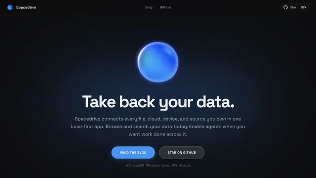
Product & SaaSA blue sphere and a quiet pool of light give a data tool a tactile impression.
A landing page for a team tool, with blue-violet light cutting through a dark surface.
Apply this idea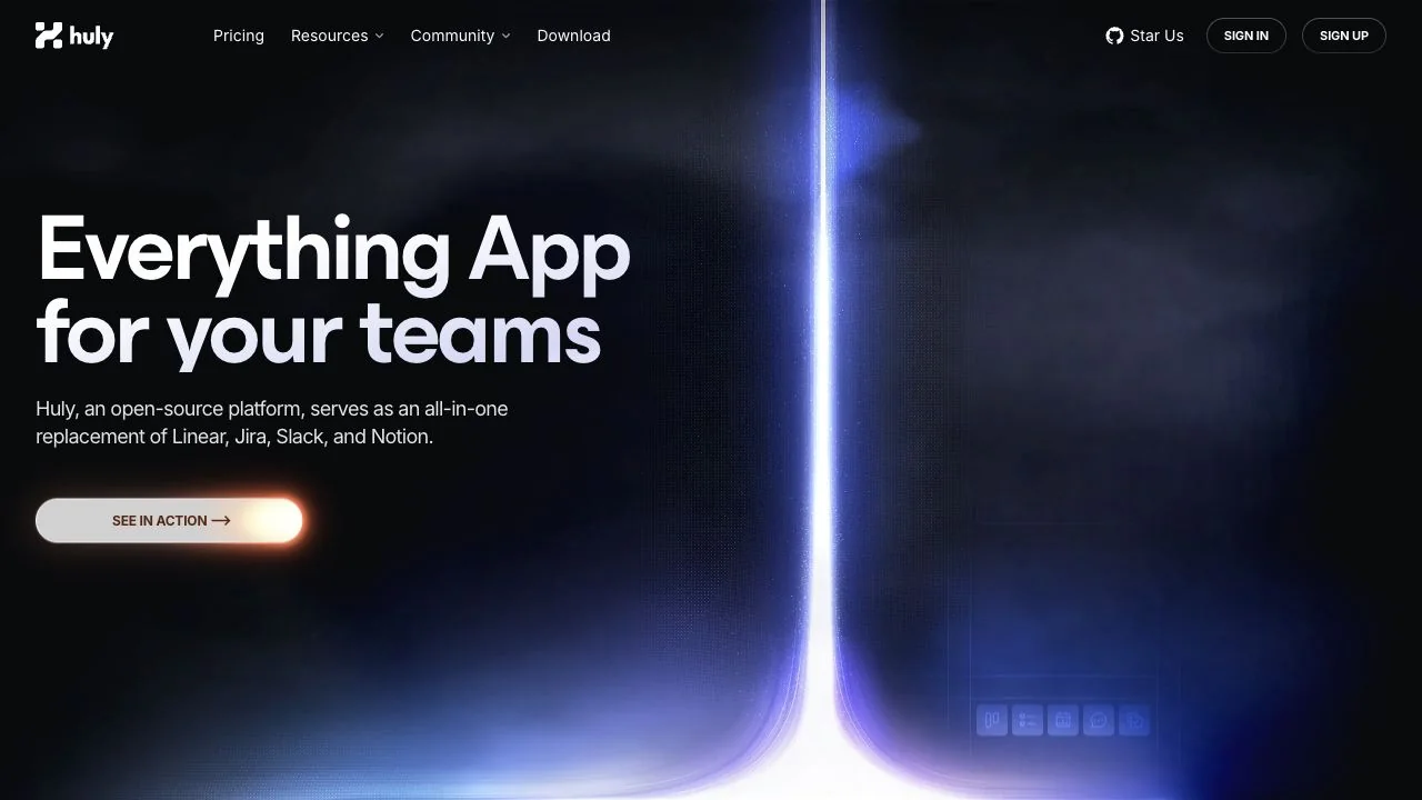
WHAT CAUGHT OUR EYE
Opposite the white headline on the left, a vertical beam on the right and a pool of light below give the screen depth.
The button itself stays a pale neutral, while warm light along its edge sets it apart from the blue-violet background.
The size contrast between the small header and the large value proposition singles out one message to read first.
MAKE IT YOURS
When using light in a dark hero, first reserve a quiet area for the copy. Keeping decorative light near the edges and giving only the primary button a different brightness makes it easier to combine visual drama with usability.
Public pages reviewed and independently presented by Design Quest.
Screens reflect the capture date. Visit the official website for its current appearance and interactions.
From study to design
Turn the study’s observations into a brief. Fill in your project details and share it with your team or an AI assistant.
Design Quest UI example
SaaS productEdit the text directly. Copy your version or save it as a Markdown file.
Pass a detail you like on to your team or friends.
Link to this study with the badge. You can also ask us to correct or remove the listing.

A blue sphere and a quiet pool of light give a data tool a tactile impression.
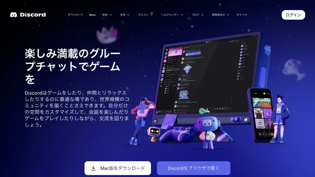
Characters and devices gather in a blue-violet space, giving a place for conversation a three-dimensional form.
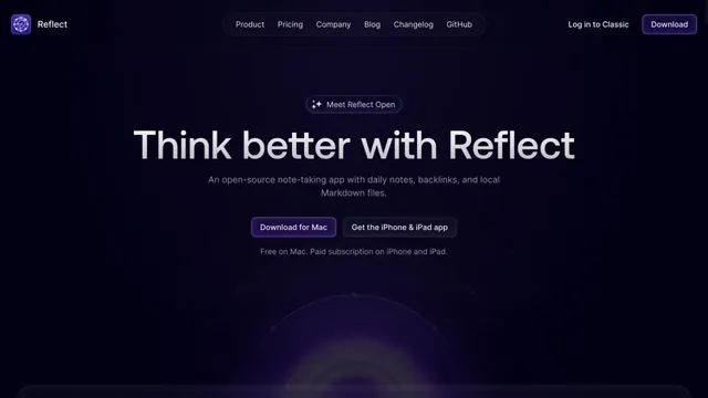
Deep purple light and dark empty space evoke a place for writing notes.