No. 001linear.app

Linear
Product & SaaSA near-black background and large headings convey the shape of the product.
15 of the 31 Product & SaaS websites in the collection use the Dark style.
Compare the brightness of backgrounds, cards, and borders. Notice how headlines and action buttons stand out within a dark screen.
Compare the first screen's message, the order in which product screens appear, and the relative emphasis of getting-started buttons.
| Studies | 15 of 81 (19%) |
|---|---|
| Share of Product & SaaS websites | 15 of 31 (48%) |
| Share of Dark style websites | 15 of 33 (45%) |
| Often paired with | Minimal (8), Typography (7), Gradient (4) |
A near-black background and large headings convey the shape of the product.
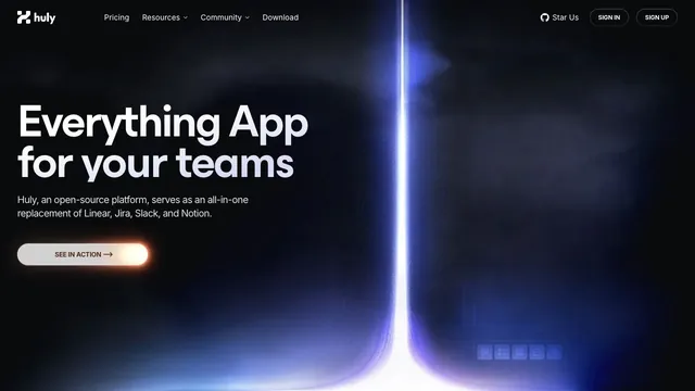
A landing page for a team tool, with blue-violet light cutting through a dark surface.
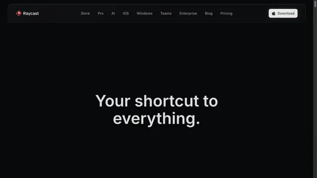
A focused landing page with white headings on a dark screen.
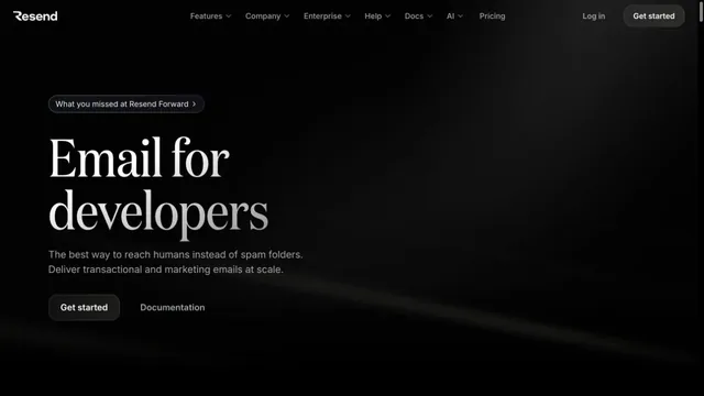
An email API site with serif headings floating in a dark space.
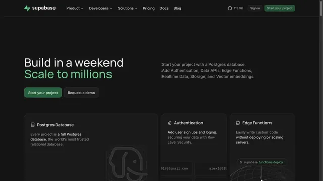
Green accents and neatly organized feature cards define the page.
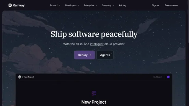
A cloud service site connecting night-sky illustrations with product screens.
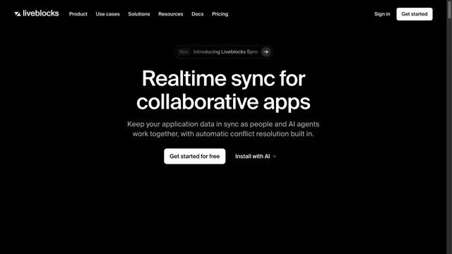
Black-and-white contrast makes a short message stand out.
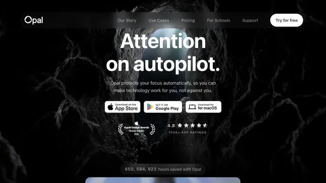
A white headline and download path stand out amid a dark, organic texture.
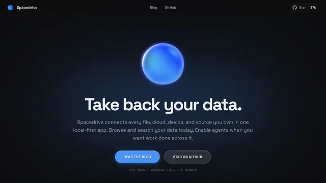
A blue sphere and a quiet pool of light give a data tool a tactile impression.
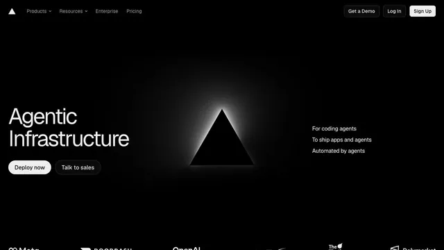
An infrastructure product entrance that anchors the eye with just a black triangle and white text.
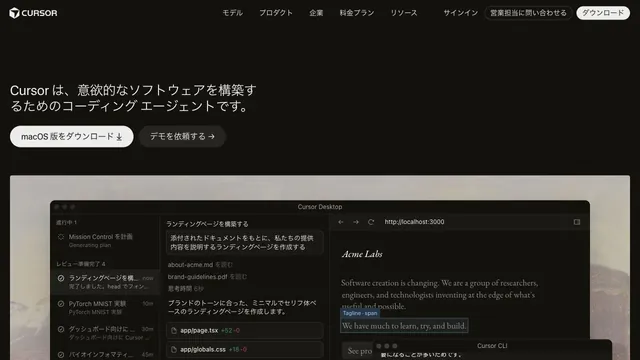
Restrained text and a large actual UI put the product itself at the center.
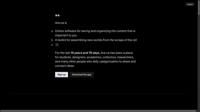
A quiet collection service site focused on short text and space.
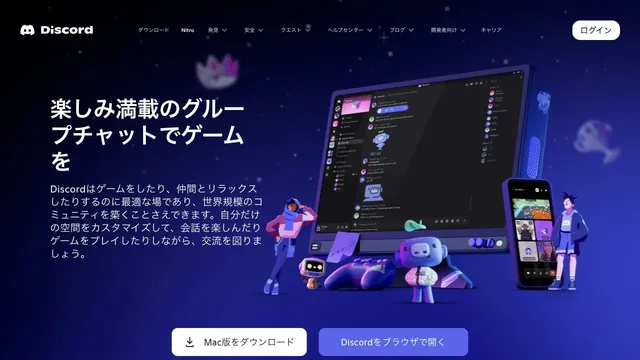
Characters and devices gather in a blue-violet space, giving a place for conversation a three-dimensional form.
Deep purple light and dark empty space evoke a place for writing notes.
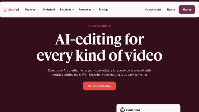
Deep wine tones and white serif type give a video editing tool an editorial voice.
Pass this list of references on to your team.
Public pages reviewed on 2026.10.27. Visit each official website for its current appearance and interactions.