No. 066discord.com
Discord
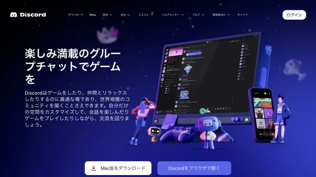
Product & SaaSCharacters and devices gather in a blue-violet space, giving a place for conversation a three-dimensional form.
A blue sphere and a quiet pool of light give a data tool a tactile impression.
Apply this idea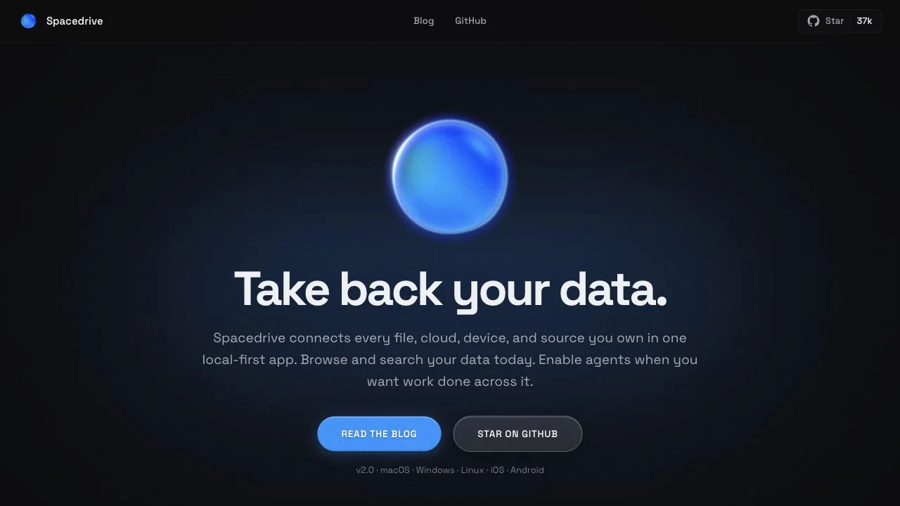
WHAT CAUGHT OUR EYE
A glossy blue sphere sits above the headline, creating a memorable visual focus before the product name.
Blue light spreads across the bottom of an almost black background, leaving a dark area where the central copy remains readable.
A blue primary link sits beside an outline-only secondary link, distinguishing priority even between actions of similar size.
MAKE IT YOURS
When introducing an abstract product, a single symbolic 3D object can help unify the impression. One approach is to share a color across the object, background light, and primary action while keeping the area behind the copy quiet.
Public pages reviewed and independently presented by Design Quest.
Screens reflect the capture date. Visit the official website for its current appearance and interactions.
From study to design
Turn the study’s observations into a brief. Fill in your project details and share it with your team or an AI assistant.
Design Quest UI example
SaaS productEdit the text directly. Copy your version or save it as a Markdown file.
Pass a detail you like on to your team or friends.
Link to this study with the badge. You can also ask us to correct or remove the listing.

Characters and devices gather in a blue-violet space, giving a place for conversation a three-dimensional form.
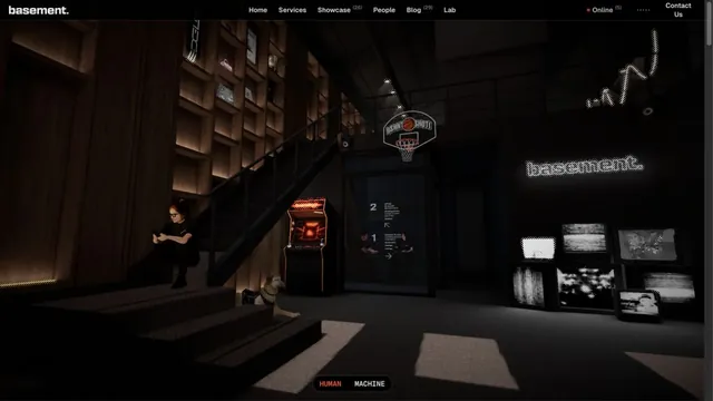
A three-dimensional brand experience entered through the studio space itself.
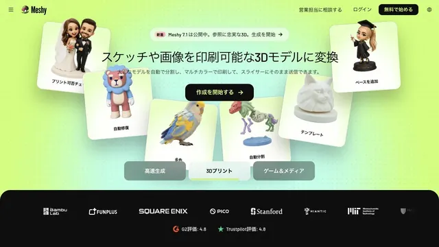
Lime-green light and 3D samples show what can be generated on the very first screen.