No. 050goodtypefoundry.com
Good Type Foundry
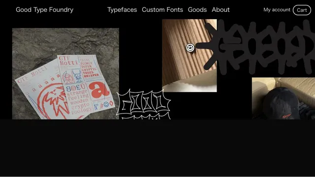
Design toolsTypefaces, merchandise, and photography share a black surface, showing the material quality of letterforms.
Fine dividers and square play controls bring live radio and on-demand listening together in one view.
Apply this idea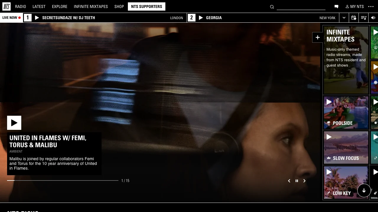
WHAT CAUGHT OUR EYE
Two live channels sit directly below the header, with their current shows presented in the same format.
A black caption panel keeps the featured show’s title legible as the large photo changes.
The feature and the mixtape rail repeat the same play triangle, making playback easy to spot on a dense page.
MAKE IT YOURS
Give recurring controls a predictable position and symbol, and let the photography vary with each show. The interaction stays familiar as programming changes.
Public pages reviewed and independently presented by Design Quest.
Screens reflect the capture date. Visit the official website for its current appearance and interactions.
From study to design
Turn the study’s observations into a brief. Fill in your project details and share it with your team or an AI assistant.
Design Quest UI example
Gradient galleryEdit the text directly. Copy your version or save it as a Markdown file.
Pass a detail you like on to your team or friends.
Link to this study with the badge. You can also ask us to correct or remove the listing.

Typefaces, merchandise, and photography share a black surface, showing the material quality of letterforms.
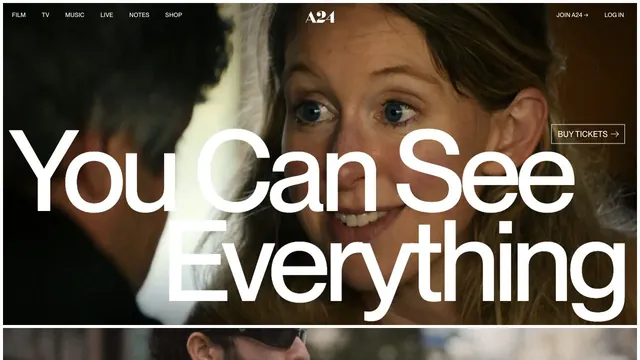
A large film image and screen-spanning type turn a film announcement into a single visual.
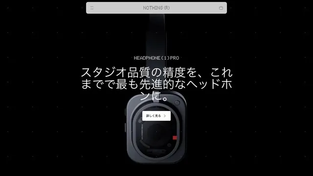
A product site that places products and brief copy in black space, using emptiness to create presence.