No. 008noguchi.org
The Noguchi Museum
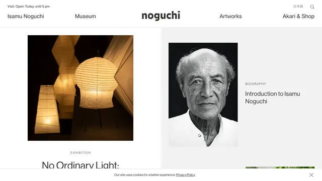
Culture & mediaA two-part layout gives the exhibition and biography separate spaces, with white space drawing attention to the photographs.
7 of the 12 Culture & media websites in the collection use the Light style.
Notice the amount of space, the readability of body text, and the boundary between background and imagery to discover ways of creating a light, airy screen.
Look for how the content's world is reflected in screen motifs and the form of its interactions.
| Studies | 7 of 81 (9%) |
|---|---|
| Share of Culture & media websites | 7 of 12 (58%) |
| Share of Light style websites | 7 of 44 (16%) |
| Often paired with | Editorial (5), Minimal (3), Typography (2) |
A two-part layout gives the exhibition and biography separate spaces, with white space drawing attention to the photographs.
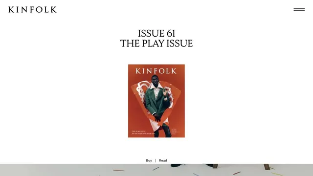
A small magazine cover set within ample space creates the sense of distance of a printed editorial object.
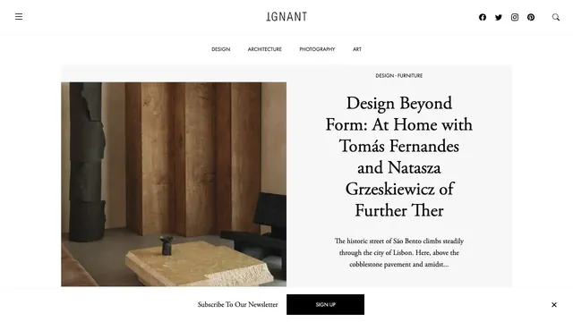
An online magazine that invites readers into an article with photography and a serif headline arranged like a magazine spread.
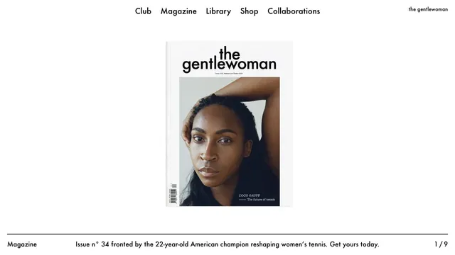
A magazine entrance centered on the cover portrait and white space, with explanations gathered along the page edges.
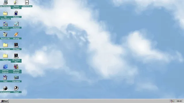
Familiar desktop controls become an entry point for exploration in the browser.
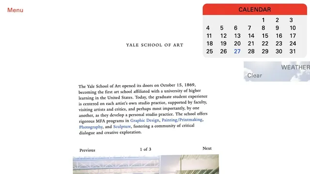
An unconventional school website where unpolished text coexists with components such as a calendar.
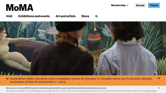
Large artwork photographs and a clear header support both viewing the work and planning a visit.
Pass this list of references on to your team.
Public pages reviewed on 2026.10.27–2026.11.13. Visit each official website for its current appearance and interactions.