No. 002huly.io
Huly
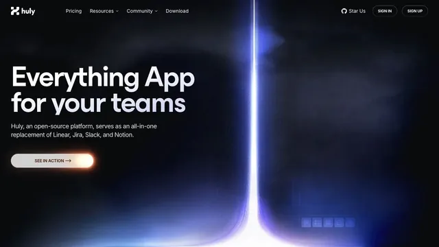
Product & SaaSA landing page for a team tool, with blue-violet light cutting through a dark surface.
6 of the 31 Product & SaaS websites in the collection use the Gradient style.
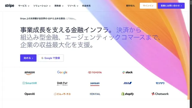
Comparing color boundaries, the direction of the spread, and text placement offers clues to balancing decoration and information.
Compare the first screen's message, the order in which product screens appear, and the relative emphasis of getting-started buttons.
| Studies | 6 of 81 (7%) |
|---|---|
| Share of Product & SaaS websites | 6 of 31 (19%) |
| Share of Gradient style websites | 6 of 10 (60%) |
| Often paired with | Dark (4), Light (2), Typography (2) |
A landing page for a team tool, with blue-violet light cutting through a dark surface.
Luminous gradients paired with clear typography.
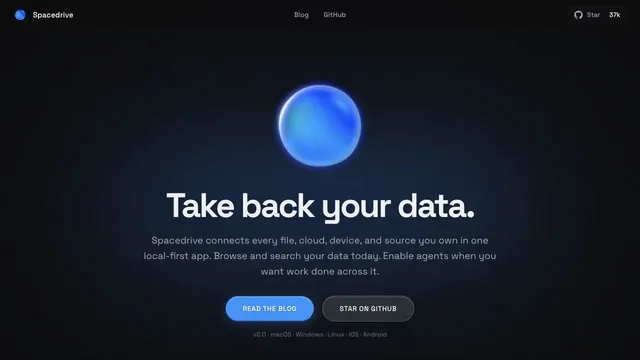
A blue sphere and a quiet pool of light give a data tool a tactile impression.
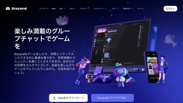
Characters and devices gather in a blue-violet space, giving a place for conversation a three-dimensional form.
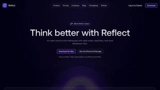
Deep purple light and dark empty space evoke a place for writing notes.
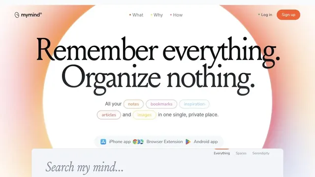
A ring of soft color and large serif type create the impression of a place to entrust your memories.
Pass this list of references on to your team.
Public pages reviewed on 2026.10.27. Visit each official website for its current appearance and interactions.