No. 033pitch.com
Pitch
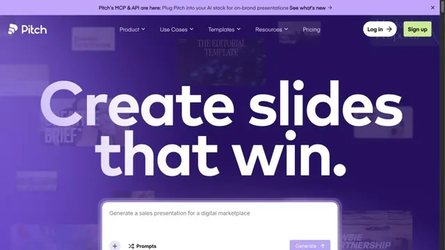
Design toolsA presentation tool with large type standing out against a purple gradient.
Diffused fields of color and a lens-like effect establish the impression of a studio working across languages and cities.
Apply this idea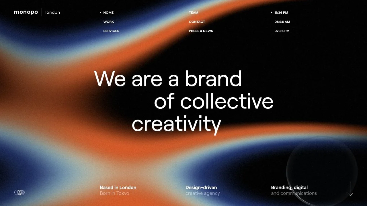
WHAT CAUGHT OUR EYE
White copy sits in front of broad, diffused blue and orange fields, with black areas left as breathing room for the text.
A lens-like area in the center changes how the letters appear, turning a short statement into something to look at.
The logo, vertically stacked menu, and clocks for several cities occupy separate positions along the top edge, separating practical information from the expressive center.
MAKE IT YOURS
With an experimental background, keep the menu and contact information in stable positions. Limiting the cursor-responsive feature and considering its boundary with the reading area can balance an engaging experience with easy navigation.
Public pages reviewed and independently presented by Design Quest.
Screens reflect the capture date. Visit the official website for its current appearance and interactions.
From study to design
Turn the study’s observations into a brief. Fill in your project details and share it with your team or an AI assistant.
Design Quest UI example
Creative agencyEdit the text directly. Copy your version or save it as a Markdown file.
Pass a detail you like on to your team or friends.
Link to this study with the badge. You can also ask us to correct or remove the listing.

A presentation tool with large type standing out against a purple gradient.
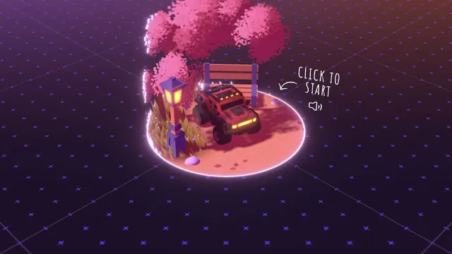
A playable portfolio that begins with a small car in a three-dimensional world.
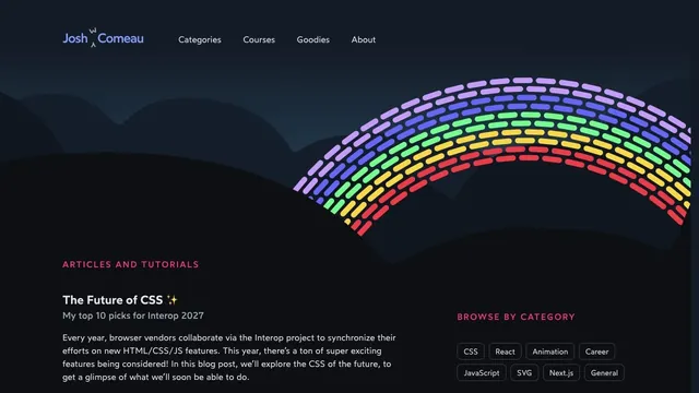
A nightscape-like background and a colorful arc add playfulness to a place for reading technical articles.